In celebration of the 30th anniversary of the first book, I created an e-commerce website in order to meet the promotional needs of the series of books, Tushita Publications. This included cover redesigns, web design, and augmented reality.
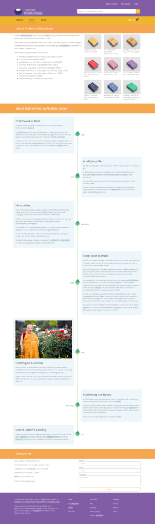
A Geshe degree is the Tibetan equivalent of a PhD, and Acharya the Indian equivalent of a Masters degree. Geshe Acharya Thubten Loden was a Buddhist monk and scholar who wrote a series of nine books on Tibetan Buddhist philosophy and practice, known as the Tushita Publications. Printed between 1993 and 2009, four of the books cover introductory topics and the remaining five focus on specialist teachings. Geshe Loden also founded the Tibetan Buddhist Society (TBS), with centers in Melbourne, Perth, and Sydney. While the books are sold by all centers, Melbourne, where he resided and taught, ultimately owns the publications.
Problem
Tushita Publications, owned by Tibetan Buddhist Society Melbourne, offers books exclusively on their website. However, people searching for the books may overlook the Melbourne Society’s site. In contrast, Wisdom Publications, a competitor, operates independently from their parent organisation and promotes their books internationally.
Data analytics show that Tushita Publications do not rank highly in online searches for “Buddhist books.” This is concerning considering the authoritative and respected nature of these publications and Geshe Loden’s standing in traditional Tibetan Buddhist circles.
Solution
To promote Tushita Publications books to a wider international audience, I suggest creating a standalone website. This site should prioritise metadata for search engine optimisation and make it easy for prospective dharma students to find the books they need.
Additionally, to celebrate the 30th anniversary of the first book, I propose adding augmented reality features and redesigning the book covers for a special anniversary edition while still offering the current covers for purchase.
I asked four participants who have read Geshe Loden’s books what they would like to see on the website, and then asked them to test other online Buddhist bookstores. Their most important responses are outlined below.
What they wanted to see
Discounts when buying in bulk (e.g. buy hardcopy, get eBook free)
Practical queries about the books’ purchases (i.e. a FAQ page)
Brief explanations about each book and author bio
A possible timeline about the author (why his books are worth purchasing)
Emphasis on there only being nine books, easy to navigate
A possible ‘Coming Soon’ section to showcase eBooks and audiobooks
Mobile-first design, as most of their purchases are made on mobile Security when buying online (i.e. SSL certification)
Testimonials and puff quotes, including those from His Holiness Dalai Lama XIV
Free shipping over a certain price to incentivise mass purchases
Expect a search function, for individual books and their classifications
An option to purchase the books’ original and modern cover
What they thought of competitor sites
Content was too wordy (including dropdowns with too much data)
Liked simple icons (interface metaphors)
Too much whitespace
Disliked subscription pop-ups (deterred from buying product)
Too much content led participants to feel overwhelmed
Enticed by free product (sample chapter/short eBook/free shipping)
Interested in horizontal scroll function, compared it with Netflix browsing
Liked a shorter landing page
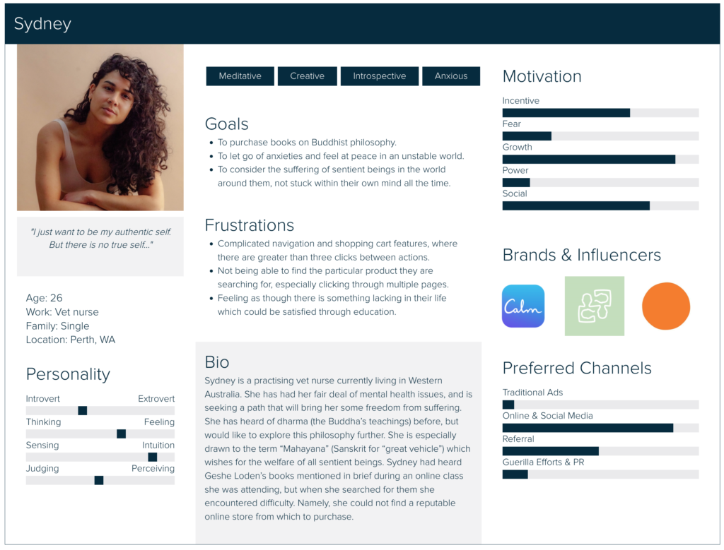
User persona
I then created a user persona for the primary audience: younger people with an interest in mindfulness and meditation who know want to learn more about Tibetan Buddhism. The secondary audience, older people with some prior knowledge, is outlined below in ‘Audience’.
Audience
The audience for users of this site is primarily 15-30 year olds who have an interest in Tibetan Buddhist philosophy, as well as older students and practitioners who already have a foundation in Buddhism.
To appeal to the younger demographic, I believe that a modern site design is necessary. Their experience on the website should be intuitive, as online purchases are the norm. The proposed redesign of the Tushita Publications book covers should complement this modern aesthetic and catch the users’ eye.
For the older students I will emphasise usability and simplicity. If they already have some prior knowledge about the publications, they will likely just be searching for the books. As such, the books will be displayed prominently on the homepage with a search feature in the navigation bar.
For both audiences, I hope they will find amusement in scanning a QR code for augmented reality (AR) integration. The new covers will come to life when the mobile device is held above them.
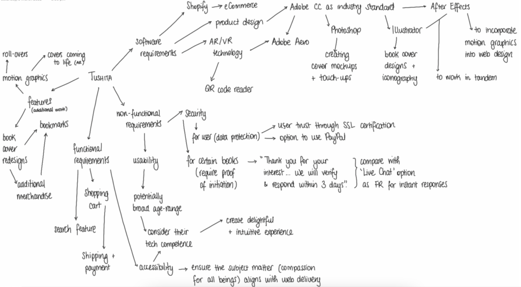
Ideation
Concept mapping
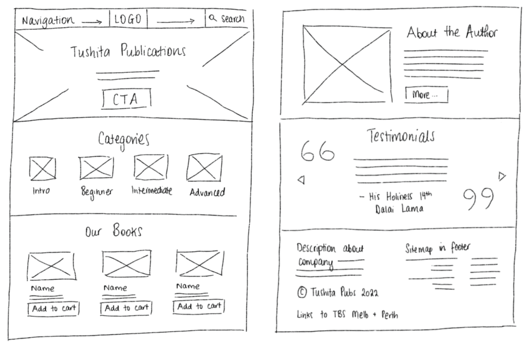
Sketches
For the Tushita Publications homepage I sought to experiment with the effectiveness of a central- versus left-aligned layout, feeling that a traditional horizontal navigation bar would be most useful for the range of ages that will visit the site. As accessibility is a key factor in its design, I wanted to build upon the foundations of web design conventions.
I experimented with including features such as carousels, either above the fold or for testimonials; interface metaphors and iconography which carried across from the book cover redesigns; a biography about Geshe Loden, the author; and a “Sort/Filter By” function to easily distinguish between beginner and advanced books.
Moodboard
I wanted to contrast a soothing colour palette, which evokes peacefulness and balance, with a touch of modernity, to bring the dharma to a digital age.
The spectrum of colours below was to unify the book covers and provide clarity. The spines were to align, with a unique icon and formatted text.
Designs
Website mockups
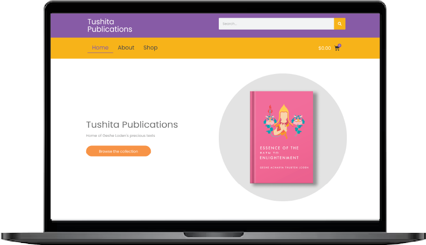
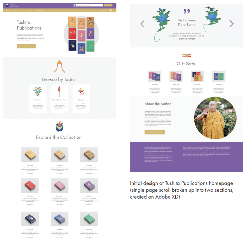
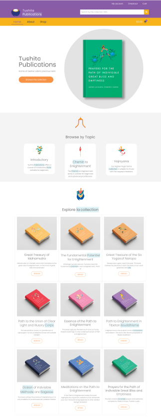
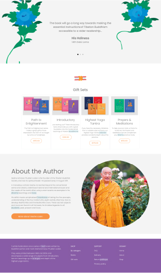
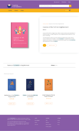
This was an early low fidelity mockup of the Tushita Publications homepage. Though tweaks were made throughout, a few interface metaphors remained. These included: the search bar above navigation, the shopping cart on the right-hand side, immediate call-to-action (CTA) above the fold, the option to browse by topic and cards in a 3×3 grid, prominent pull quote and testimonials from key people in Tibetan Buddhism, the purchase of gift sets, and a section about Geshe Loden.
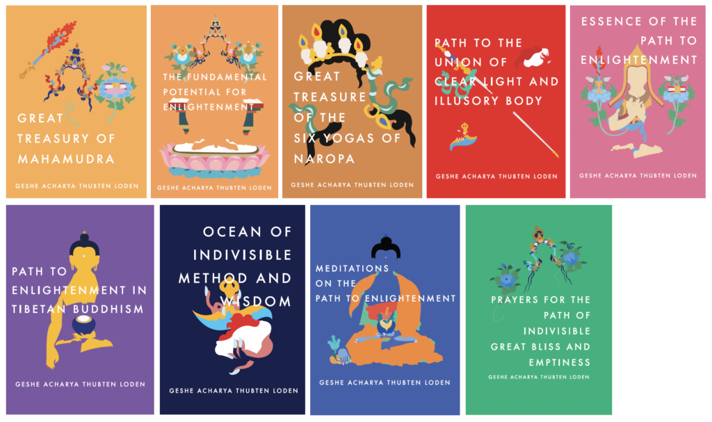
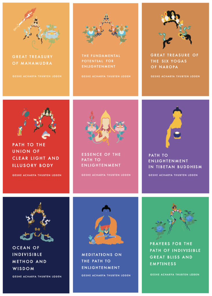
Cover redesigns
This was the first iteration of new book cover designs. They did not meet the necessary readability or consistency necessary. The final covers are pictured below.
From the initial designs, usability and readability were often highlighted as potential concerns, so the greatest changes that did occur included: providing enough contrast in text and background colour, size and prominence of buttons or type – in order to convey hierarchy, illogical or unfamiliar navigation – people expect a convention in visiting each site.
Tushita Publications includes a total of 25 pages. 13 pages relate to the products (books and gift sets), the remaining provide details about the author and books, as well as privacy and returns policies and FAQs.
Redesigned book covers
It was important that the overall website design complemented the design of the book covers. For this reason, they were created in tandem with many adjustments occurring throughout the process.
Accessibility was a key factor in their design. This included contrast of colour and text, as well as a cohesive set of illustrations that would convey that the publications are a series.
Augmented reality (AR) implementation
For the element of augmented reality that I wished to include, I animated the book cover illustrations. This meant using Adobe software: Illustrator, After Effects, and Aero.
I animated the individual layers of these designs in After Effects, such as the flames rising along the wisdom sword, flower blooming, and hair gently blowing in the wind. These were exported as GIFs and anchored to the book cover images to play when scanned.
Below are final designs of each GIF. They had changed from solid 16:9 colour block behind the deity, to complete transparency, and finally the inclusion of a circle to give the impression of three-dimensionality.
Reflection
I was pleased with the final outcome of this project. While there were many minor difficulties I experienced, these were able to be resolved.
Once such experience was using WooCommerce integration as a WordPress plugin, as customising the design of the cart and checkout was not always within my control (for user security). Of course, this was due to my being unfamiliar with the software. With greater time spent using these plug-ins I feel they will be most useful for the sales of the Tushita Publications.
A similar difficulty was the use of Adobe Aero, another application I had not used prior. I eventually had to compromise by including animations with a reduced frame rate, but this adds a retro feel and plays into the augmented reality that I was going for.
I still intend to present the website to the Board of Directors at the Tibetan Buddhist Society Melbourne centre. I will propose that they may edit any of the written elements to better reflect the brand, if they do decide to launch the site officially. As a business proposition, and with the possibilities that could eventuate, I will stand firm in my beliefs.


